Every designer reaches that moment — the layout is done, the typography is locked, and now it’s time to show the work to someone who doesn’t speak “InDesign.” That’s where mockups earn their keep. But not all mockups are created equal, and picking the wrong scene type can quietly undermine even the strongest editorial design.
This guide walks you through the real decisions designers face when choosing a Magazine mockup for presentations, portfolios, and client deliverables.
Why Scene Type Matters More Than You Think
A mockup isn’t just a pretty wrapper. It sets context, communicates intent, and influences how the viewer emotionally responds to your design. A finance magazine shown in a coffee-table lifestyle scene sends mixed signals. A literary journal dropped into a tech flat-lay loses its soul entirely.
The scene type you choose is a design decision in itself.
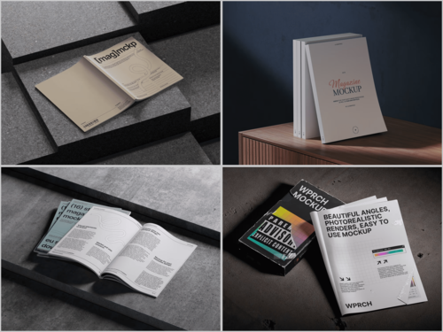
The Main Magazine Mockup Scene Types
Flat Lay Scenes
Flat lays place the magazine horizontally, usually photographed from above. They work beautifully when the cover design needs to speak for itself without distraction. Add a coffee mug or some scattered pages, and you’ve got a lifestyle feel that suits consumer magazines, food publications, and culture titles.
Best for: Lifestyle, fashion, food, and travel editorial projects.
Perspective and Angled Shots
These scenes show the magazine at a dynamic angle — slightly turned, sometimes fanned open. They give the publication a sense of weight and dimension. Clients instinctively trust a design more when they can “feel” the physical object.
Best for: Portfolio presentations, pitch decks, and premium brand work.
Stack and Spread Scenes
Multiple copies of the same magazine stacked or spread across a surface communicate volume and authority. This is the scene type that makes indie zines look like newsstand staples.
Best for: Print run visualizations, magazine brand identity presentations.
Open Spread Mockups
Nothing shows off interior layout work like a proper spread scene. Two pages, fully open, often photographed in natural light. If your value is in the typography and the grid — show it here.
Best for: Editorial design portfolios, content-heavy layout showcases.
Held-in-Hand Scenes
A hand holding a magazine introduces human scale and immediacy. These scenes make the viewer feel like a reader rather than a spectator. They’re warmer, more relatable, and excellent for social media use.
Best for: Instagram presentations, client mood boards, reader-focused brands.
Real-World Uses of Magazine Mockups in Practice
Mockups aren’t just portfolio decoration — working designers use them daily across a surprising range of contexts:
- Client approvals: Showing a cover concept inside a realistic scene reduces the imagination gap. Clients approve faster when they see the final product rather than a flat file.
- Social media content: Studios and freelancers use lifestyle mockups to announce new projects on Instagram and Behance, without needing to print a single copy.
- Publisher pitches: Editors pitching redesigns internally use spread mockups to make layout changes tangible to non-designers on the team.
- Print run previews: Before committing to printing costs, art directors use stack scenes to visualize how a large run will look across newsstands.
- Teaching and tutorials: Design educators use open-spread mockups to demonstrate grid systems and typographic hierarchy in context.
Magazine Mockups on ls.graphics
ls.graphics offers one of the strongest magazine mockup libraries available for professional designers. Their scenes feature ultra-realistic rendering and premium production quality that holds up in any presentation context. The PSD files come with organized, clearly labeled layers — swapping your design in takes minutes, not hours.
The library covers a wide range of angles, lighting setups, and color styles, from minimal white-surface compositions to moody, editorial-toned environments. Stylish minimalist scenes make up a strong part of the collection. The Edit Online feature lets you apply your design directly in the browser — no Photoshop required. Crucially, a generous selection of free scenes is available to explore before committing to anything.
Conclusion
Choosing the right magazine mockup scene isn’t a minor detail — it’s part of the presentation design itself. Match the scene type to the publication’s voice, the client’s expectations, and the platform where it will live. For designers who want quality without compromise, ls.graphics is a consistently reliable starting point. The range is broad, the realism is genuine, and the free options make it easy to find your fit before you commit.